When the iPadOS 14 beta first launched, we wrote this feature under the title 'The good, the bad and the missing features'. Now that iPadOS 14 is readily available for most iPad users, we've tested the software again and re-written this article with the new features in mind.
You can now download iPadOS 14 on all compatible iPads, after a beta earlier in the year. We've been using the beta build for several months now, and upgraded to the full version of the software as soon as it became available.
We originally planned to update this article looking at all the new features, but quickly realized something: plenty of the promised iPadOS 14 features aren't actually available on the tablets. Some of the most intriguing and promising features can't be found on iPads right now.
That's not so scandalous as it initially sounds – when Apple unveils new operating systems, lots of the features it announces don't come in the first version of it, only appearing later. So maybe we'll see some of these features in iPadOS 14.5 or similar in the next few months.
But for people who are downloading iPadOS 14 so they can use these new features and tools, it can be a bit disappointing to discover it's not actually working right now. So we're going to run you through all the big iPadOS 14 features and let you know if they're great, disappointing, or just not there at all.
iPadOS 14: the good

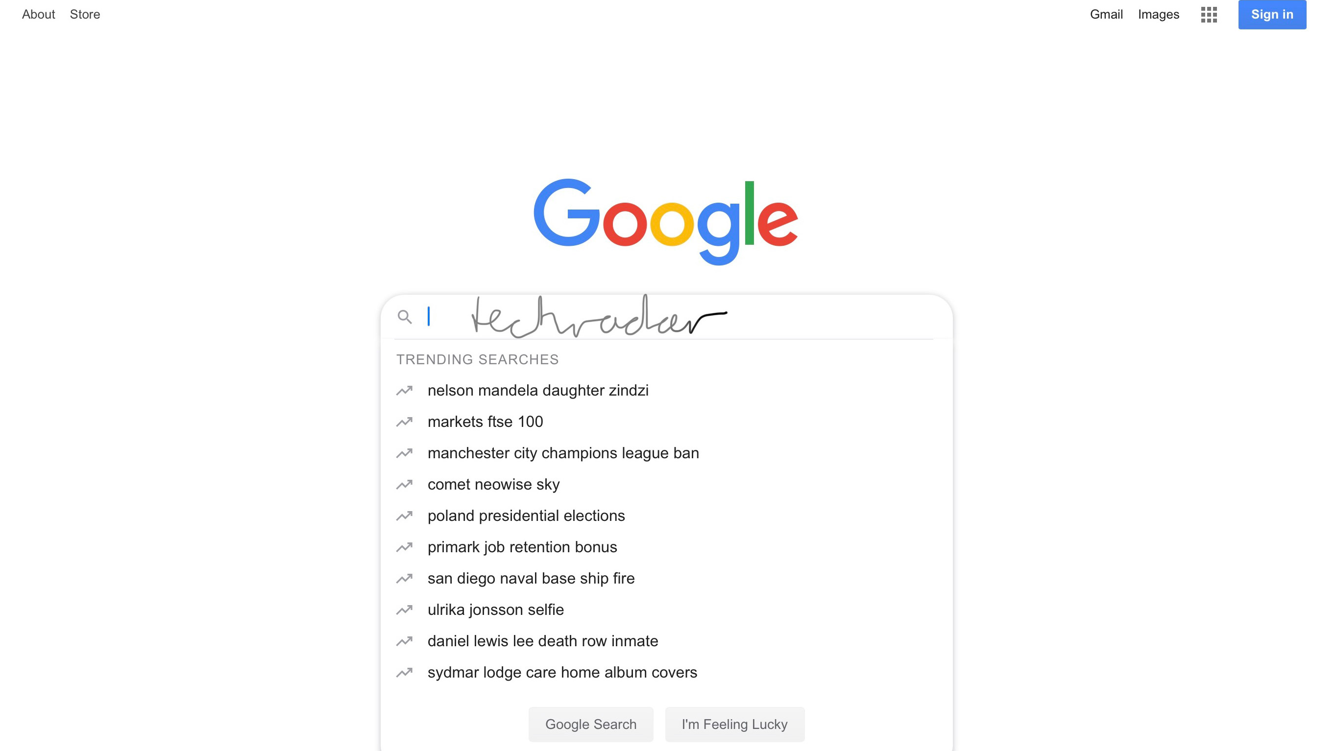
The most reliable iPadOS 14 feature remains hand-writing recognition. No matter how many times you do it, the ability to hand-write notes that become text always remains novel. We've found operating system is pretty nifty at detecting our atrocious scribbles too, with only a few errors here and there.
We'd imagine people with neat handwriting will find this feature flawless, and even messier writers won't be disappointed. It's not clear if the AI can learn to understand your handwriting better over time, but that would be neat too.
Not only can you use the Apple Pencil to write, you can also edit text with it. Drawing a horizontal line through text will select it all so you can easily edit it, and drawing a vertical line will add in a space. We'd imagine these will really help people out, as they're easier than using your finger for those same functions.
This whole feature isn't quite as useful if you've got a keyboard folio, since typing remains much quicker than hand-writing (for us, at least, and we'd imagine many others) but if the Apple Pencil is your weapon of choice you might find this feature neat.
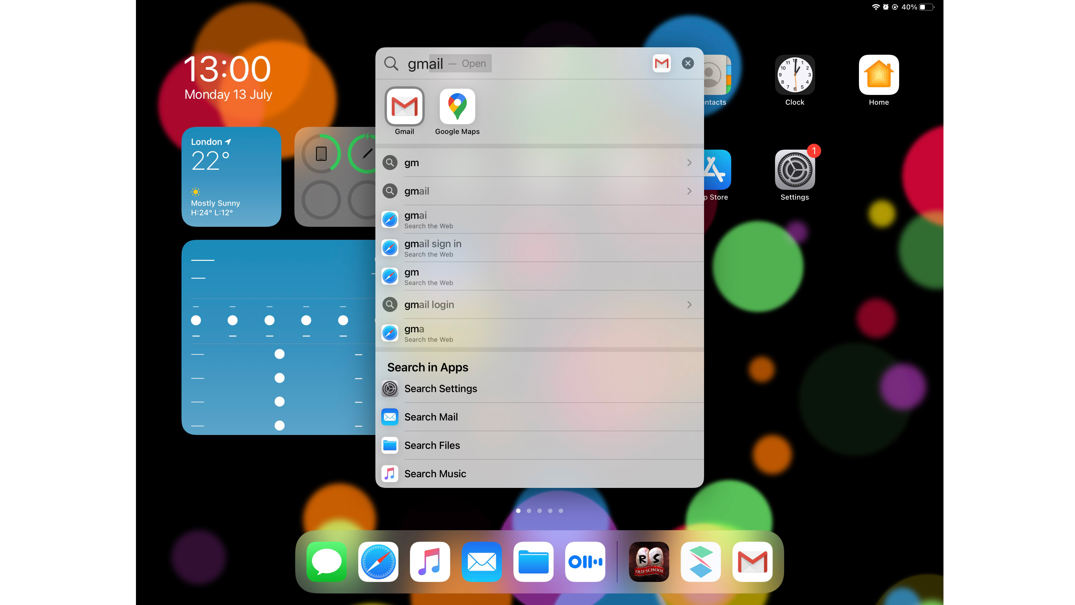
Our other top feature is one of the smallest – the improved search bar, which has one small change that speeds up operating system navigation. Before, when you searched, apps that seemed to match your search would appear below the search bar, but now when you start typing, the app that seems most like your search term will be auto-appended – if you hit enter, this app opens straight away.
For example, when we typed 'gm', Gmail automatically appeared, and we just had to press enter to open it, rather than reach up to the screen to get it to open. This saved a few seconds every time we were looking to open a different app.
Using this kind of navigation to get around our iPad quickly became second nature – we rarely swipe through menus now, as the search bar is so useful. We can't imagine how we got around the tablet before!

iPadOS 14: the bad
We've just mentioned text recognition in our 'good' list, but let's briefly mention it in our bad list, because the iPad sometimes struggles to know we want to use the feature.
Frequently, when we picked up the Apple Pencil and tried to move it around the screen on a text box, we only ended up dragging the page or app we were on and no pencil lines appeared. It's not entirely clear why the drawing mode didn't work in this case, and we had to resort to typing with our fingers (oh, the humanity!)
Another big annoyance is Siri – the digital assistant was meant to get smarter, but it actually feels like it got a bit dumber.
Our main issue is that Siri keeps popping up when we don't want it to, like an insufferable friend that always tries to insert itself into situations. When we were listening to music, watching video, playing games (and also in the middle of the Apple September event stream), when a word sounding even tangentially similar to 'Siri' popped up, so did the little glowing orb in the bottom right of the screen.
Sometimes the orb appeared and did nothing, just waiting and listening; other times it brought up search results relating to words said after the trigger.
An example: during the aforementioned Apple event, Siri popped up every time the word 'series' was mentioned, which ended up happening pretty frequently given the full name of the Apple Watch 6 is the 'Apple Watch Series 6'. At one point while the Apple Watch Series 3 was being discussed, Siri brought up the Wikipedia page for the third season of US TV show Supernatural... for some reason.
We've no idea what triggered this, and the Safari page snippet got in the way of lots of screen space. We ended up completely turning Siri off for iPadOS 14, which made the iPad experience way less infuriating.
On the iPadOS 14 website, Apple boasts that Siri has 20x more facts than it did three years ago. That may be the case, but as with all know-it-alls, Siri seems to want to constantly reel off these facts, and we don't like it.
iPadOS 14: the missed potential

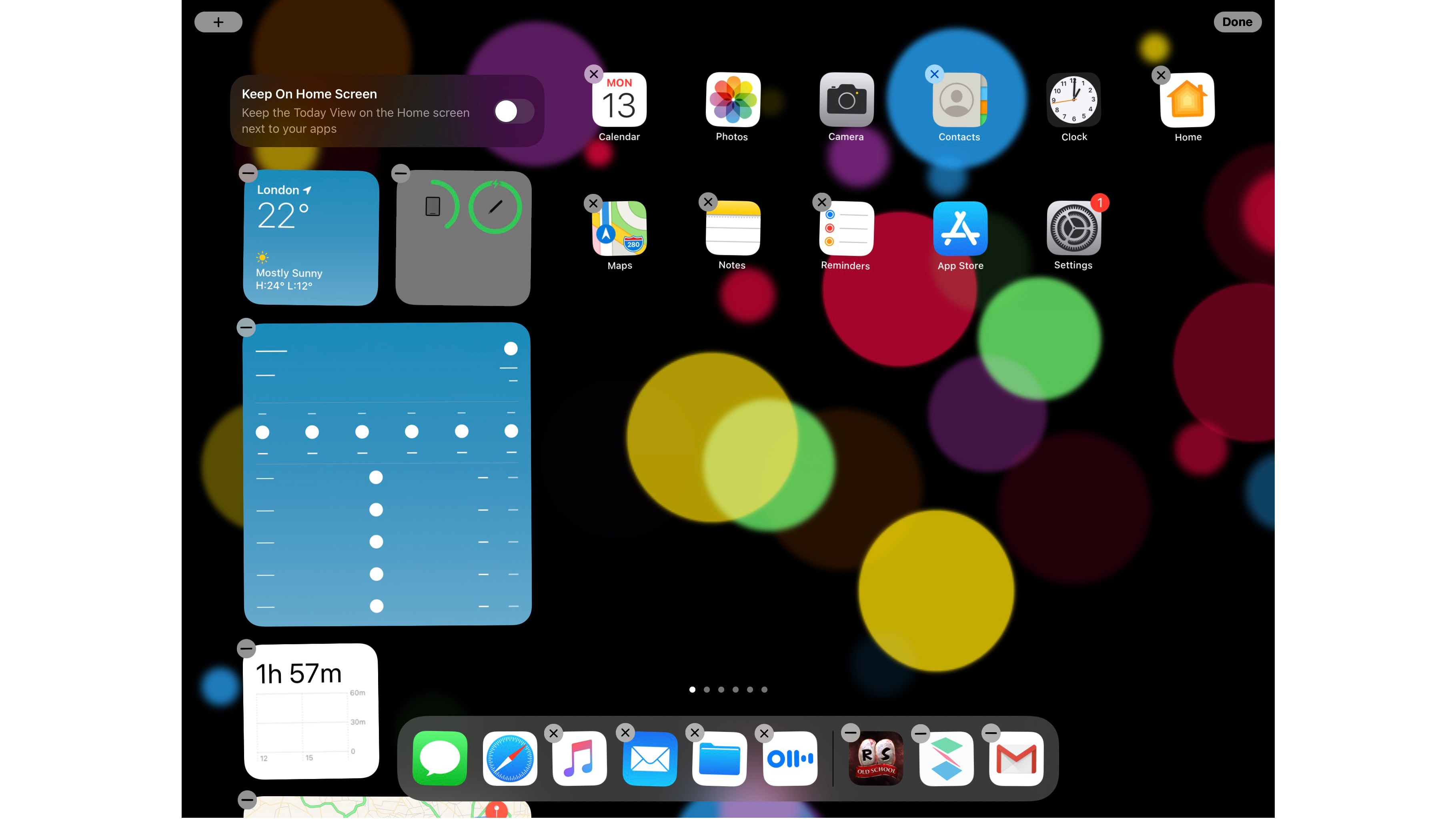
Other than Apple Pencil text conversion, the other anticipated feature for iPadOS 14 (which is mainly an iOS 14 feature) is widgets. We were disappointed by the lack of them in the beta version of iPadOS 14, and while there's definitely more now, it still feels like a missed potential.
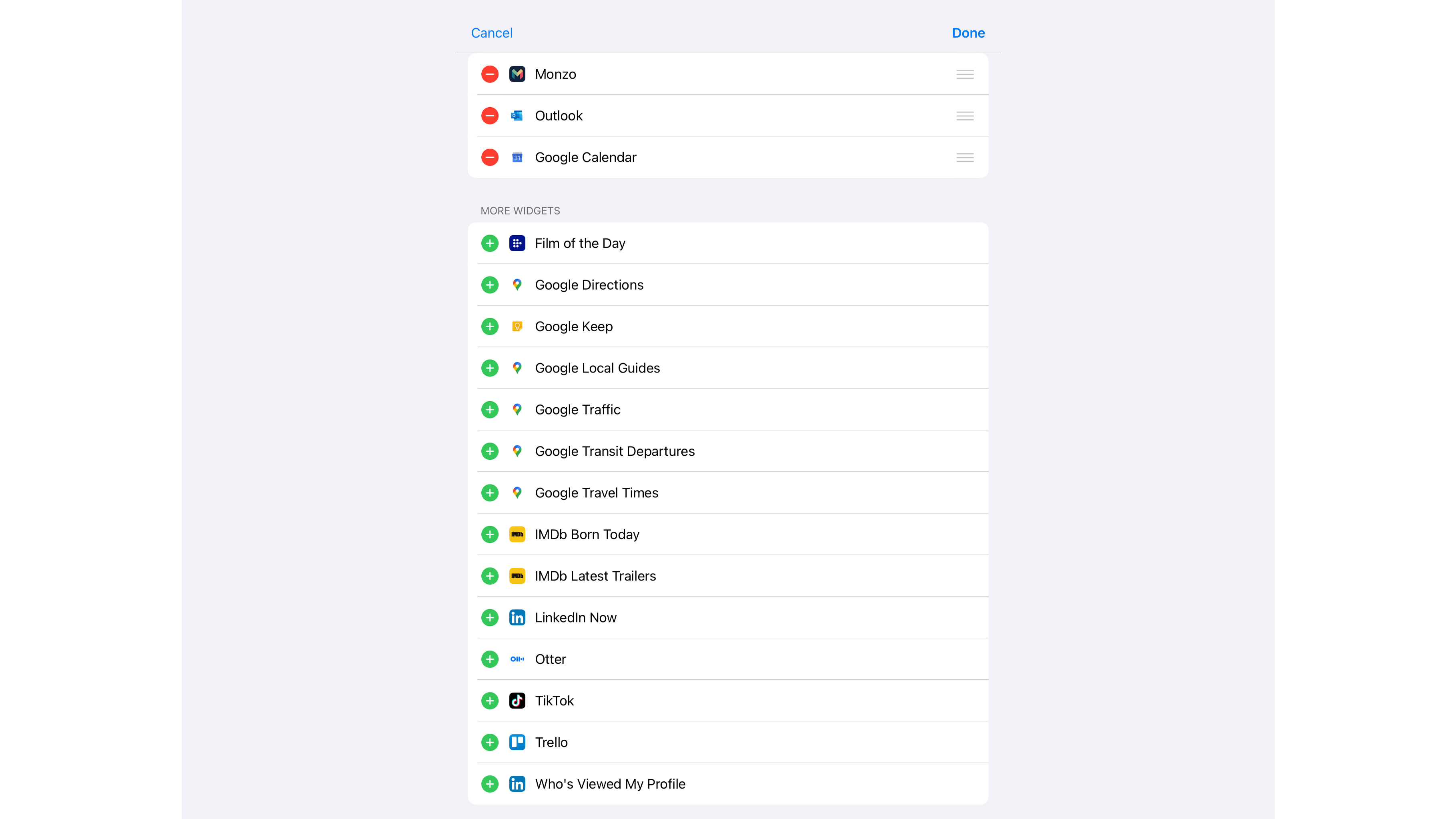
We've got plenty of iPad apps but only a scant few of them have useful widgets. Props to Google Maps for having loads, Mubi's Film of the Day was always useful, and a few apps had buttons for easy access, but that was it.
Some apps like IMDb, LinkedIn and Outlook had widgets that were pretty useless, and after setting these up we promptly removed them. But the vast majority of apps don't have any kind of widgets at all.
That's a shame, as we can see loads of ways they'd be useful – maybe tiny bars for social media apps to show you notifications, widgets for productivity apps so you can quickly bring up tools, or blocks from Netflix or Amazon Prime to show you new content. At the moment, there aren't enough interesting ones.

It's likely more will be added over time, but right now we found ourselves disappointed.
It's also worth pointing out that, unlike on an iPhone, iPad widgets can't go wherever you want. Instead, you have to leave them in the left-hand panel of the home menu. That's a lack of customization we'd hope gets remedied soon.
iPadOS 14: all the missing features
There are loads and loads of features that are apparently part of iPadOS... that don't actually come with the update.
The 'low power mode' that was rumored to be part of the operating system update isn't here, as far as we can tell – there's no mention of it in the Control Center or Battery section of the main menu.
The iOS 14 security feature that was meant to be present in the App Store, where it would apparently list all the permissions an app would ask of you so you can make up your mind whether to download it, doesn't seem to be here either. When we looked at App Store listings of various apps there was no such feature.

Similarly, there was meant to be a 'Privacy Report' feature for Safari, so you can check on the validity and safety of websites. We can't find a way to enable this at the moment.
One of the touted iOS 14 and iPadOS 14 changes was Maps, as the app was meant to see an overhaul to rival Google Maps better, but it hasn't changed for us. This might be an unfair complaint, as Apple itself stated the feature is rolling out to different regions over time, so some users might have improved Maps now. We don't though, and many others won't either, so it counts as a missing feature to us.
We haven't seen App Clips used at all. They were meant to be mini versions of apps you could find on web pages, for example, that enabled one function of an app without you having to install the whole thing. Maybe these will pop up more and gain wider use over time.
As we speculated above, it's possible Apple will bring lots of these changes over time, but if you're a keen user of iPadOS 13 looking forward to the new upgrade, just be warned you might not see all the revolutions you were hoping for.
from TechRadar - All the latest technology news https://ift.tt/35V5NjY
EmoticonEmoticon